“When you compare yourself with others, your only options are arrogance or self-defeat”
– John Spencer
I came across the quote above in a blog post by educator and maker John Spencer. He is writing about personal self-doubt, but I believe the quote applies equally well to organisational self-doubt, especially in healthcare (@helenbevan).
Benchmarking is often portrayed as an instrument to stimulate learning and improvement, but quite often the opposite is the case. I think the quote reflects this problem well. The self doubt begins when we are at school, when the results of our essays and exams are publically displayed. Personally, I was often in the bottom part of the list. That position did not encourage me to work harder. Rather, I became familiar with a sense of defeat.
In healthcare, we often see a similar reaction when confronted with our own results, in comparison with the national average. I have yet to meet a manager or CEO who was inspired by benchmarking results to improve their performance.
It all depends on how we benchmark. Presenting results in a bar graph, from low to high with the median as a line across, is the easiest way. However, these types of visualisations inspire arrogance or a sense of defeat. They tend to convey false messages, depending on which side of the line you find yourself. Even if there has been huge improvement, the ruthlessness of that median line will leave you with a “pass” of “fail” feeling.
In my humble opinion there is a much better way to benchmark — one that has a greater chance to encourage and inspire organisations to improve. The key aspect is to take into account variation in the data.
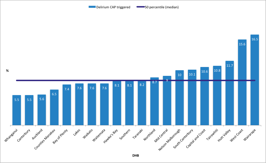
Fig 1. Ranking of the percentage of InterRAI assessments in aged care facilities per DHB where the delirium CAP was triggered in the period 2018-2019. (Source: InterRAI website New Zealand (https://www.interrai.co.nz/data-and-reporting/)
The kind of visualisation I am talking about here is called a funnel plot. This displays results either outside the funnel (statistically significant, in relation to the mean) or within the funnel (insignificant, in relation to the mean). This leads to narrower control limits when a smaller variation in the data is expected (larger population) and wider ones when a larger variation is expected (smaller population). It is an approach that produces a balanced view, helping organisations avoid false assumptions about their work.
The funnel plot below shows that the majority of DHBs are within the funnel, indicating that there is no statistical difference in their distance from the mean value of 7.8%. Only five DHB have a significantly higher percentage (red bullets) of assessments that triggered the delirium CAP. Another three have a significant lower percentage (green bullets) and are located outside the funnel.
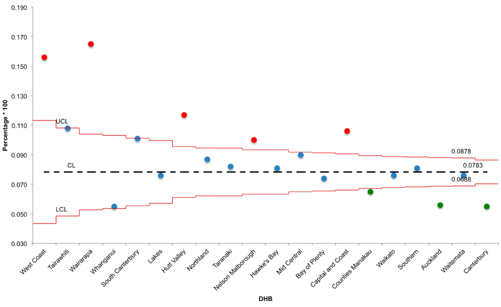
Fig 2. Funnel plot displaying the percentage of InterRAI assessments in aged care facilities per DHB where the delirium CAP was triggered in the period 2018-2019. (Source: InterRAI website New Zealand (https://www.interrai.co.nz/data-and-reporting/)
In conclusion, funnel plots are a useful visualisation tool which provide a balanced view on how different units (organisations/ facilities / DHBs etc) are performing, when compared with each other. They stimulate a validated learning process (what are the green bullets doing? What can the red ones can learn from this? Why are the greens doing so well?). This helps avoid feelings of arrogance or defeat.
The challenge for improvement is to get most of the unit results within the funnel. This is followed by aiming to reduce or increase the mean (CL), depending on what you want to achieve. This is achieved by introducing changes in the care process by using the model for improvement (PDSA cycles).
Data collected through the InterRAI assessments can be used for this purpose, particularly the CAPs and the outcomes measures. These provide a wealth of useful information. Unfortunately, accessing and analysing raw interRAI data requires certain skills. Care-Metric has these skills: we can provide you with visualisations that tell your story. We analyse your data on the requested topics and create different types of visualisations, ones which display meaningful results in a storytelling format. This provides relevant information to those working directly with the residents, as well as management and the board.
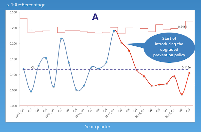
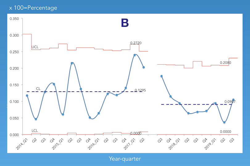
See below an example visualisation of how a change in the process of preventing pressure injuries resulted in a reduction in the number of pressure injury L1 and L2 CAPs triggered.
Triggered pressure injury CAPs (L1-L2) have come down after upgrading prevention policy
Percentage of quarterly InterRAI assessments that triggered the pressure injury CAPs L1 &L2